Heyo! I started writing this development log last night as I was redoing some stuff in my website, and man… it turns out trying to code this into my site took a bit longer than expected.
For those who don’t know, the way I make my blog posts is a bit different than your standard blogging procedure. There’s probably a waaay easier way to do this, but this so far is the easiest method I’ve found. Firstly, I write them in LibreOffice first. This is to make sure I don’t have any spelling issues or anything of the sort. Then I have to tag everything using HTML tags during the copy/paste process into Phoenix Code, my code editor of choice.
For some odd reason, I thought I could make the code directly in LibreOffice to save myself some time. I was wrong. I was horribly wrong. Everything started getting formatted incorrectly, and it became a complete mess. With that, I had to spend some trial and error to make everything look decent again. I think what I’m trying to say is this; I still need to get used to the HTML formatting methods. I'm still pretty new to everything and there is lots to get used to. Not a complaint, though!
However, after spending a little bit of extra time to make sure everything looks right, now it’s all good and ready. And I think it looks good enough. Anyways, sorry about the rant! I’m excited to finally not only get this blog post up but also a new version of the Grownden website up! Here’s a look at what’s new!
A few days ago, Tecnosine (an online friend of mine, hi if you’re reading this!) and I were talking about some web stuff before I decided to go the Neocities route, and he let me know I needed to work on my contrast. So he sent me a website for color palettes that I referenced, and, after a bit of careful experimentation, I figured out how to make the colors a bit more accessible! And it looks great! If you’ve already been to this site before-hand, you’ll probably see a slight difference and, hopefully, it’ll look better on your screen!
Here’s a picture if you want to see what that looks like compared to the old version.
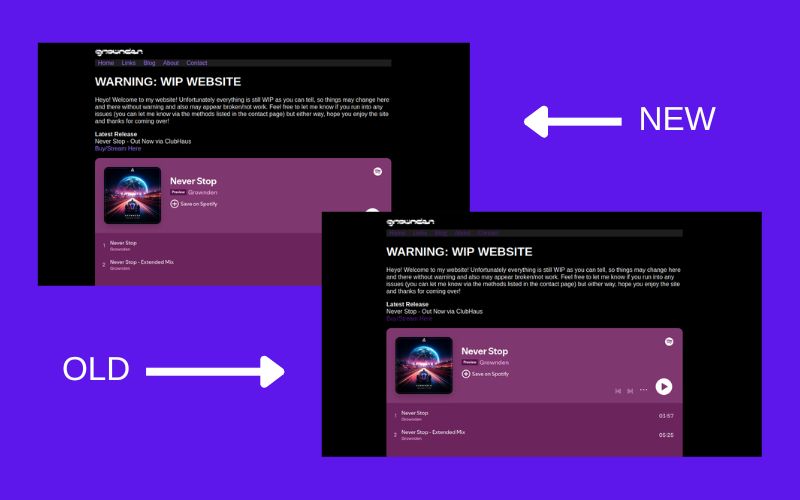 A comparison between the new and old website. Notice the slight color change.
What's also neat is that this picture literally scales accordingly depending on the browser window size! Maybe I might utilize this knowledge on other aspects of this website? Something to think about.
One thing that bothered me directly is the logo. Usually when you go to websites, clicking the logo would usually send you to the homepage. Unfortunately, my website didn’t do that until now. Now, when you click my logo, it’ll send you straight to my homepage! Not really much to explain here.
That’s pretty much it for now, but I’ll still be continuing developments on this website. Who knows, maybe I might actually start writing blog articles? But I don’t really know what to blog about yet. However, what’s for certain is this website will still be improved upon, so feel free to reach out via email / Bluesky / Discord DMs if you spot any other issues or have any other feedback! Thanks for reading and have a good one!
Copyright 2025 Grownden. All rights reserved.
#ProgressiveTranceNeverDies